7 Rules for Choosing the Color Scheme for a Website
When people visit your site, the first thing they notice is the colours, and your colour scheme has a big effect on both style and consistency.
Find out how to choose the right colour palette and work it into your site’s design system.
Experienced designers from all kinds of backgrounds will tell you that colour schemes require a lot of thought and planning during the web design process.
Because this topic is so broad, there are a lot of best practises to learn in order to make the best colour scheme.
After we know how important colour schemes are in website design, we’ll be able to make better decisions about design in the future and do better in our jobs as web designers.
When it comes to branding, colour schemes are almost always an important part of a brand’s design system or style guide, which is a set of rules that defines a brand’s personality, brand messaging, brand imagery, and content assets.
We all know that branding is one of the most important parts of making a website.
So, a clear, well-thought-out colour palette will help us solidify our brand identity, making our websites and their content look polished and professional.
There are many best practises and “rules” that web designers should follow to make the most of their web design skills and show how well-known and skilled they are as web designers.
It’s time to learn how important website colour schemes are and what rules you can follow to make yours the best.
What is a colour scheme for a website?
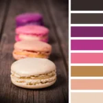
A colour scheme for a website is the group of colours that a designer chooses for the site.
Color schemes can have as few or as many colours as the designer wants. They are also called colour palettes.
On the website, each colour can be used for a number of different parts. This means that the same colour can be used for different kinds of parts.
Color palettes are usually made up of two groups of colours: primary and secondary.
The primary colours are usually the ones that stand out the most on a website, like the colours of the background, logo, menu, etc., while the secondary colours are often used as accent colours, among other things.
Most of the time, you’ll also see that a colour palette has different shades of the same colour. This gives the design of a website a varied but consistent feel.
Consistency is one of the most important things to think about when making a colour scheme for your website.
Because brand personality is so important to a successful website and business, having a consistent colour palette helps to solidify your brand identity. This is because when you use the same colours and styles over and over again, your audience will start to think of your brand when they see those colours and styles.
Why the colours of a website are important
1. They show what you look like.
Your important choice of colour scheme becomes your visual identity. It’s how your visitors and potential customers will remember your brand, which is called brand recognition.
This kind of visual identity turns into a way for you and your target audience to talk to each other, since different user personas will be drawn to different colour palettes.
Color schemes also show what your brand is all about, which is why they have such a big impact on how you feel as a user.

2. They give a first impression
As people who make websites, we know that when we design (and re-design) them, we often think, even if it’s in the back of our minds, “What kind of first impression will this design make on my visitor?”
One of the most important things about website colour schemes is making a good first impression.
This is true to the point that 94% of people who took part in a survey in 2018 said that the design of a website affects their first impressions of it.
3. They help people feel connected
Lastly, different colour palettes make people feel and think about things in different ways, even if they don’t realise it at first.
Depending on how you want to talk to your audience and visitors, the colours you choose will have a big impact on the way your “conversation” flows and how you sound.
The subject of colour psychology is its own world, which we will talk about soon.
7 Rules for Picking a Color Scheme for a Website
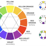
1. Get to know the colour wheel.

The first thing you need to know about colour theory is how the colour wheel is divided into three groups: primary, secondary, and tertiary.
The red, blue, and yellow primary colours are the base colours of the colour wheel, and all the other colours come from these three.
Then, there are the secondary colours.
When you mix any of the three primary colours, which are orange, green, and purple, you get secondary colours.
The last group of colours is the tertiary colours, which are also called “middle colours.”
When you mix a primary colour with a secondary colour, you get one of these.
Red-orange, yellow-green, and blue-purple are all examples of these.
Understanding how colours work together doesn’t end here.
But now that we know how colours are made, we can talk about how they “interact,” or work with each other, and how we can put together our own colour schemes.
Even though the relationships between colours on the colour wheel fall into clear “categories,” there are many different ways that these colours can be put together, which is where colour combination types come in.
2. Know the Different Types of Color Combinations
Each colour has its own character and meaning, and the same is true of the relationships between them.
Depending on how the “personalities” of the colours mix, you often send a certain message or idea to your website visitor when you choose a colour combination.
For example, if you choose a colour scheme with red and blue, which are complementary colours, red, which stands for urgency and strength, and blue, which stands for peace and loyalty, you’ll end up with a strong, stable, and loyal atmosphere.
If, on the other hand, you choose two or more colours that go well together instead of ones that clash, you create a totally different vibe.
As a web designer, it’s up to you to decide which colour combination works best for your site.
Colors That Look the Same: Side by Side
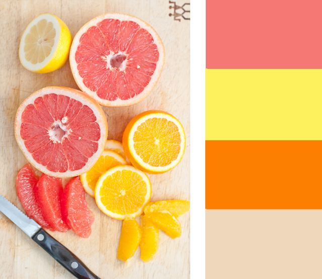
Similar colour schemes are made up of three colours that are right next to each other on a 12-spoke colour wheel.
When trying to make a website that looks both modern and classy, web designers often use colour palettes with similar colours.
For example, a similar colour scheme with red, red-orange, and light orange will draw attention to how well the red and light orange go together.
Colors that go well together: Opposites attract
Red and green, blue and yellow, blue and orange, and red and blue are all examples of colours that go well together.
What these pairs have in common is that they are two opposites of each other. You can find them by looking at the colour wheel and finding the two colours that are directly opposite each other.
In web design, primary colour combinations are important because they make one colour, especially accent colours, stand out. This is because the colours are so different from each other.
When making a website, it’s important to use complementary colours for things like buttons and navigation menus.
If you want people to notice a button and click on it, use a complementary colour scheme for the text and background. This will make it much more likely that people will notice it because the text and background are so different from each other.
In the same way, the text on a button will be much easier to read if its font colour is different from its background colour.
This can often lead to more clicks and sales, and the same is true for navigation menus and menu items.
Evenly Spaced Triadic Colors:
A triadic colour scheme is any three colours that are 120 degrees apart on the colour wheel. It is thought to be the most basic type of colour scheme.
Triadic schemes can be thought of as the most flexible of the three types of combinations because there are many ways to measure 120 degrees.
Different from analogous colours, which can only be three colours that are somewhat similar, or complementary colours, which can only be colours that are different from each other.
Triadic colour schemes can be thought of as a mix of the two, since they can use both analogous and complementary colours. This gives you even more room to be creative.
As you can see, there are a lot of different ways a web designer can put colours together.
3. Take into account colour psychology
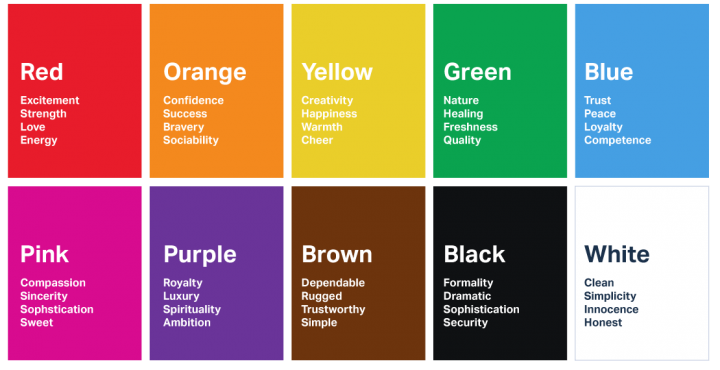
The whole field of colour psychology is based on the idea that different colours make people feel and act in different ways.
If you’ve never heard of colour psychology before, you’re in for a real intellectual treat.
Color psychology says that choosing your website’s colour scheme based on the emotional experience you want to give your users will not only affect the personality of your brand, but it will also make visitors act in certain ways based on the mood you create.
Once we know what each colour means, it’s easy to choose the best colour palette for our website.
For example, if you’re making a website for your spa business, it makes sense to use colours that represent nature and healing, like green, and maybe blue, which stands for peace and trust.
Because the colour wheel has so many colour palette options, using colour psychology as a guide when choosing your colour scheme can help you make better design decisions and narrow down your theme and style in a way that fits your business and industry.
To find out more about the psychology of colours check out our blog on psychology here.
4. Think about the visual hierarchy
As people who make websites, it makes sense for us to pay attention to visual hierarchy.
Last year, “6 Rules of Visual Hierarchy That Will Help You Design Better” was written on the Shutterstock blog.
They explain that these rules are based on the main goal of putting design elements in order of importance. This “guides the viewer through the design and makes sure the message is clear and concise,” they say.
The first and most important of Shutterstock’s six rules has to do with a website’s colour scheme. This rule is called “Make a Focal Point with Color.”
From this, we can see that your colour palette is one of the most important design choices to think about when you’re thinking about the visual hierarchy of your website.
This is true no matter what colours you choose for your text, buttons, backgrounds, etc.
This way of thinking says that when you have a hero text and a description below it, the colour of the font and the colour of the background are both very important.
In the image above, for example, the heading and subheading are much easier to spot because they are each a different colour.
So, the “more important” text is in a darker colour, and the “less important” text is in a lighter colour that stands out.
The eye goes to the h1 before the subheading because the h1 is more noticeable, and it’s easy to see each in its own way.
In the second image, both pieces of text are the same colour, so the eye sees them as one unit and takes longer to figure out that they are two separate things.
The design principle that colour palettes set the order of visual elements applies to almost every part of a website that you can see.
This is true not only for the text colours we talked about, but also for the colours of the background and the buttons.
Most of the time, the best way to make a button stand out and show how important it is is to choose a button colour that will get people’s attention and lead to a higher clickthrough rate.
With the online CSS code generators, you can make the styles for border-radius, fonts, transforms, backgrounds, box and text shadows.
5. Pay attention to call-to-actions, especially clickable colours
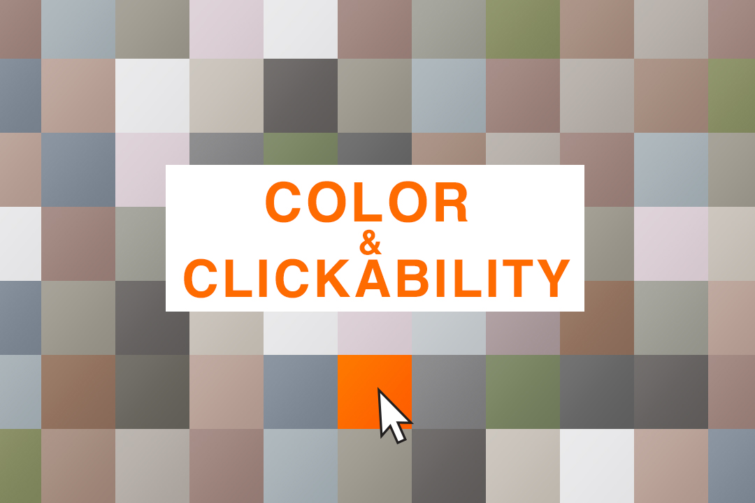
It’s not all about how you look.
This means that, yes, a colour palette that looks good is one of the most important parts of good web design.
Still, it’s just as important to think about how your colour palette affects your users’ experience.
When you want people to do something specific when they look at your website, the colours you choose can be a very important factor.
The above example from IC Creative shows what happens when you put a brightly coloured button on top of a dark background overlay.
The black overlay makes the white text and bright orange button stand out without making them clash with the photo in the background.
At the same time, the overlay’s transparency lets you see some of the people in the background of the image.
This shows that a powerful colour scheme is made up of two or more colours that are very different from each other, like black and bright orange.
You could also choose different shades of the same colour and apply them to a group of elements. This can show that the elements are related, but some are more “important” than others.
6. Think about how responsive your design is

Every web designer should know by now how important it is to have a design that works on any device.
But what may not be so obvious about how to make your website responsive is that it’s not just about how big and how it’s laid out.
Color palettes are also a big part of how a website will look on a mobile device.
In fact, if you make your colour palette with mobile responsiveness in mind, it will often make your design process much easier.
So, you can be sure that your text elements are easy to read no matter what size the screen is, and that your icons and buttons are just as easy to see on mobile as they are on desktop.
Because mobile screens are so much smaller than desktop screens, you may find that you need less colours for mobile than you do for desktop.
If there are too many colours on the smaller interface, it might look too busy, but with more space on the desktop, you can use more colours without making the interface look too busy.
Here, Slack’s website is a great example of how to choose a primary colour for a colour palette based on how it looks on different devices.
Their choice of a bright purple colour draws attention and is easy to see on any screen.
It’s loud enough to be fun and exciting on a small (mobile) screen, but dark enough that it won’t be “too much” on a desktop.
Adding different shades of the same colour to your colour scheme is another way to make sure your mobile UI doesn’t have too many colours but still has visual hierarchy and stands out.
The colour shades are close enough to each other that the mobile interface will look clean and put together, but they are different enough to keep your website interactive and interesting.
7. Embrace Neutral Colors
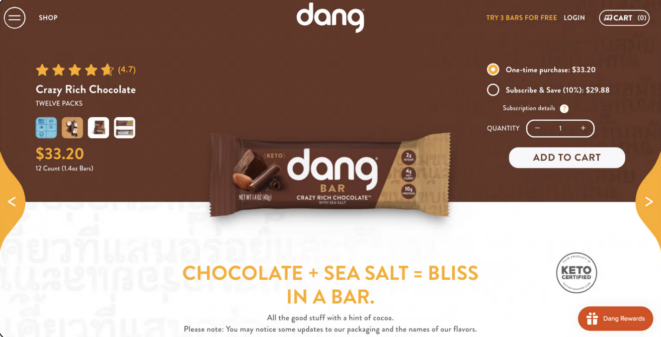
Neutral colours are necessary for any good colour scheme, even though they aren’t as exciting.
Even if you only use them for text, neutral colours should be part of every professional colour palette.
No matter how beautiful colours that aren’t neutral are, website visitors will need a “break” from visual stimulation at some point, especially when trying to process qualitative information through text.
In the example above, dang’s website has a rich colour scheme with orange, green, and brown, but it still needs to use white.
Using white makes their “buy now” and other “calls to action” stand out, makes their navigation icon and menu look clean and clear, and makes their logo stand out among the dark, detailed images.
Keeping to the Rules
Now that we know what website colour schemes are and why they are an important part of every web designer’s process, it’s time to check our own sites to see if we’ve followed the rules.
As we said at the beginning of the post, consistency is one of the most important rules to follow when making a website’s colour scheme.
In order to attain that consistency, there are many principles, as we mentioned, to keep in mind.
This includes, among other things, knowing how to use the colour wheel, trying out different colour combinations, thinking about colour psychology, putting visual hierarchy, actionability, and responsiveness at the top of the list, and using neutral colours.
When you use a beautiful colour palette throughout a website in a smart way, visitors will not only enjoy using your site in the moment, but they will also remember it for a long time.