Mobile website development means what exactly? Basically, There Are 7 Rules

There has been a dramatic shift in how people search the web since more and more individuals are doing it from their mobile devices. Since there are over 3.8 billion smartphone users globally, it is crucial that your site is mobile-friendly. But the challenge is figuring out how to optimise effectively.
This blog is for you if you wish to provide top-notch mobile design to your site users. Find out more about the idea of mobile web design tools, and then utilise our compiled set of resources and guidelines to create a user-friendly mobile version of your website.
What is mobile website design and development?
To create a website that works well on mobile devices is the goal of mobile web design. Among the steps in this procedure are the following:
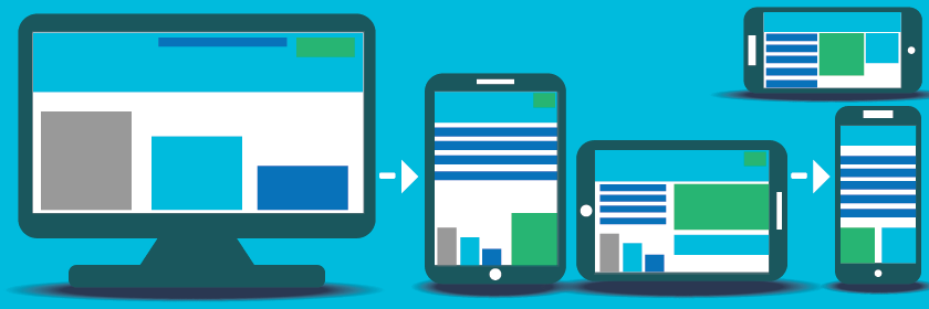
- Creating for mobile first. Websites were formerly built with desktop users in mind, but as mobile surfing has become more popular, designers now prioritise making sites accessible on mobile devices. This implies that the team prioritises mobile first, tailoring content to the smallest screen feasible, before moving on to other platforms and greater display sizes.
- Flexible layout. A layout that responds to the size of the user’s device is called a responsive layout. In general, the more real estate a user is afforded, the greater the quantity of material they will take in at any one time.
- Search engine friendly design features help search engines index and rank content. If people can’t locate your website in search results, it doesn’t matter how engaging the content or features are. Your website’s mobile friendliness may be verified using Google’s Mobile-Friendly Test
A guide on making a mobile-friendly website.
Researching potential customers and the market is the first step in developing a mobile website. The product group studies the market to determine what problems need to be fixed.
Prototyping is the first step in developing a mobile user interface, and it usually include making both low-fidelity and high-fidelity mockups. The product team starts by creating a low-fidelity prototype that just displays how content will be laid up on individual pages.
Next, they add real material and images to the low-fidelity prototypes in order to evaluate the design with actual users. Once a team has a verified high-fidelity prototype, they may use web frameworks like Bootstrap, Angular, or React or site builders like Elementor for WordPress to create the final product.
What are the 7 essential elements of a successful mobile site?
Products, including websites, are designed around the user experience they provide. Here are the seven most important guidelines to follow when making a great mobile design:
1. establish a reliable data hierarchy.
People that often utilise mobile devices tend to be extremely goal focused. People that go online have high standards for how soon they can get what they’re looking for. Most internet users skim rather than read online pages word for word. This is why it’s crucial for mobile website design to have strong scannability. Your site’s navigation should help users easily locate the content they need.
To help you create a successful website, consider the following:
- Don’t put up with data that you don’t want to see. Don’t overwhelm consumers with details they don’t need.
- Maintain a prominent placement for both vital information and significant call-to-action buttons. Your homepage should immediately provide visitors with the information they need.
- Maintain a clean visual divide between the menu and the content. The design of a website’s menu system is crucial to its usability. Make use of white space to divide your content and menus.
2 Make your page design as easy as possible
Because users’ focus is so valuable, it must be distributed sensibly. Designing mobile layouts with simplicity in mind is essential since it is easier to read and navigate a clean and uncluttered interface on a mobile device’s smaller display. Getting there may be broken down into the following steps:
- One-column layouts should be used consistently. As a rule of thumb, a multicolumn web design grid is used to organise content when designing websites with a desktop computer in mind. On mobile devices, however, a single-column design is preferable since additional columns may increase visual clutter and make it difficult for users to absorb content.
- Stop using the horizontal scroll bar. Not only does horizontal scrolling result in a bad user experience (UX) (as it is counterintuitive to scroll in that direction), but it also fails Google’s Mobile-Friendly Test.
- Remove unnecessary elements from the design. Users on mobile devices shouldn’t have to sift through too much data at once, since this may be frustrating. In order to provide your consumers with a streamlined and concentrated mobile experience, it’s recommended that you adopt a minimalist design aesthetic, making use of short language and removing simply ornamental features. Keep in mind that everything you put on your site, from words to pictures, should be adding something of value to the experience for the reader. If you need help with the design of your next website, look no further than our assortment of UI kits.
3. utilise big touch targets and legible writing.
Because so much information is conveyed by text, or copy, readability, or the ease with which a text may be understood by a reader, is a crucial feature of web page design. The following characteristics should be kept in mind while designing for readability:
- Typeface. Choose a font that will scale well and look excellent on devices of all sizes. It’s possible to use either Helvetica or Roboto, both of which are excellent choices.
- Scale of the font. The recommended minimum text size for mobile devices is 16 pixels.
Differentiation of hues.
- Make an effort to reach level AA of the Web Content Accessibility Guidelines 2.0.
Touch targets being too small is another issue for smartphone users. Users tap things on mobile devices’ screens with their fingertips, however the increased likelihood of accidentally touching other parts of the screen is exacerbated by smaller touch targets. Users will have an easier time navigating your website if you employ big, easy-to-press buttons. On touchscreen devices, 7-10 mm is the sweet spot for object size.
4. reduce the amount of work required of the user to enter data.
It’s important to build efficient forms so that your visitors don’t have to spend too much time submitting data, even if doing so is not the most interesting element of the online experience. A few things to keep in mind while making forms:
- Obtain the least amount of data necessary. The time and energy of form fillers may be reduced if only necessary fields are required.
- Allow for shipping and billing addresses to be pre-filled automatically. The user’s geolocation data may be used to populate their address fields automatically.
- Validate user input dynamically via inline validation. Users will realise they made a mistake in entering data before they even hit the “Submit” button.
5. Layout with a focus on quick page loads
In the field of interface design, speed is a factor that users value highly. Users are more likely to leave a site if it takes too long to load its content. Therefore, it is advised to monitor performance and get rid of anything that slows down load time. Image size, video length, and the presence of complex animations may all contribute to how long it takes a website to load.
Read the Front-End Performance Checklist 2021 for helpful advice on how to speed up your website.
6. Parity in appearance and functionality across mobile and desktop

App and web-based versions of the same digital good are becoming the norm. If your product can be used on both platforms, then the app and website for mobile users must have the same feel and functionality. It’s preferable if your mobile app and mobile website seem like one and the same to your users, who can then effortlessly move between the two.
7 Let them complete their adventure on a different device
Customers often begin an action on a mobile device, then go to a desktop to complete it. Buying something from an online retailer is one such instance. Visitors prefer mobile for surfing, but prefer desktop for completing forms. Include “Share” buttons for people to easily forward links to themselves through email.
Consult your target audience at every stage of the design process.
Using the aforementioned guidelines, you may make a fantastic mobile site design, but it is essential to test your work with actual consumers. When applied to the actual world, even the most meticulously studied design inevitably has problems. By catching problems early on via testing, you can improve the user experience you provide.


