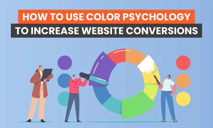
How to Use Color Psychology to Improve Your Website Design
Even if you haven’t studied colour psychology, you’re undoubtedly aware that various hues elicit distinct feelings and meanings.
Your preferred colours are often underlying variables in how you arrange your home, the clothing you wear, the automobile you drive, and even the foods you want.
Color is also important in branding, marketing, and web design.
In fact, colour may account for up to 85% of a person’s decision to purchase from a brand.
Color has the power to develop or destroy brand trust, improve or decrease consumer loyalty, and form 90% of a customer’s view of a company in only 90 seconds.
So, whether you start out to commission your first website or a revamp of an old one, it should come as no surprise that your web designer would immediately inquire about your website colour preferences.
Before you respond with your own preferences, go through our guidelines for making wise web design selections based on colour psychology.
Step 1: Think about the significance of each hue.
To some level, you may already be aware of the connotations connected with certain colours.
When you need to relax, you may be attracted to the colour blue, but the colour orange may not appear suited for official business papers.
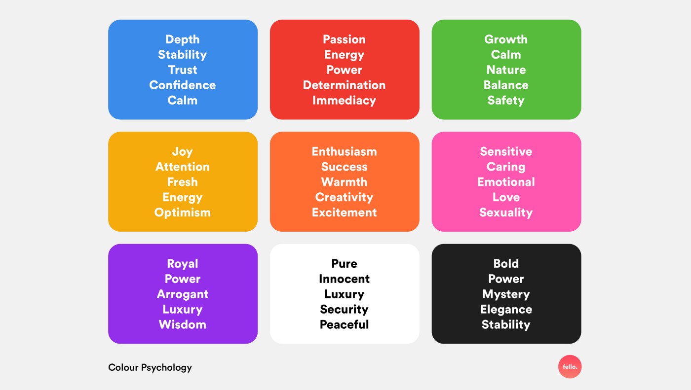
The psychology of colour
The psychology of colour
Some of these traits may explain why some colours are more popular in certain sectors.
Blue, for example, is a popular hue for banks, whilst crimson is highly suggested for dating service businesses.
Meanwhile, a consumer who visits a bright yellow website to read articles about relaxation and deep breathing may get the impression that something isn’t quite right – even if they don’t know why.
Consider the following typical meanings connected with certain hues.
Which ones did you notice right away?
What astonished you the most?
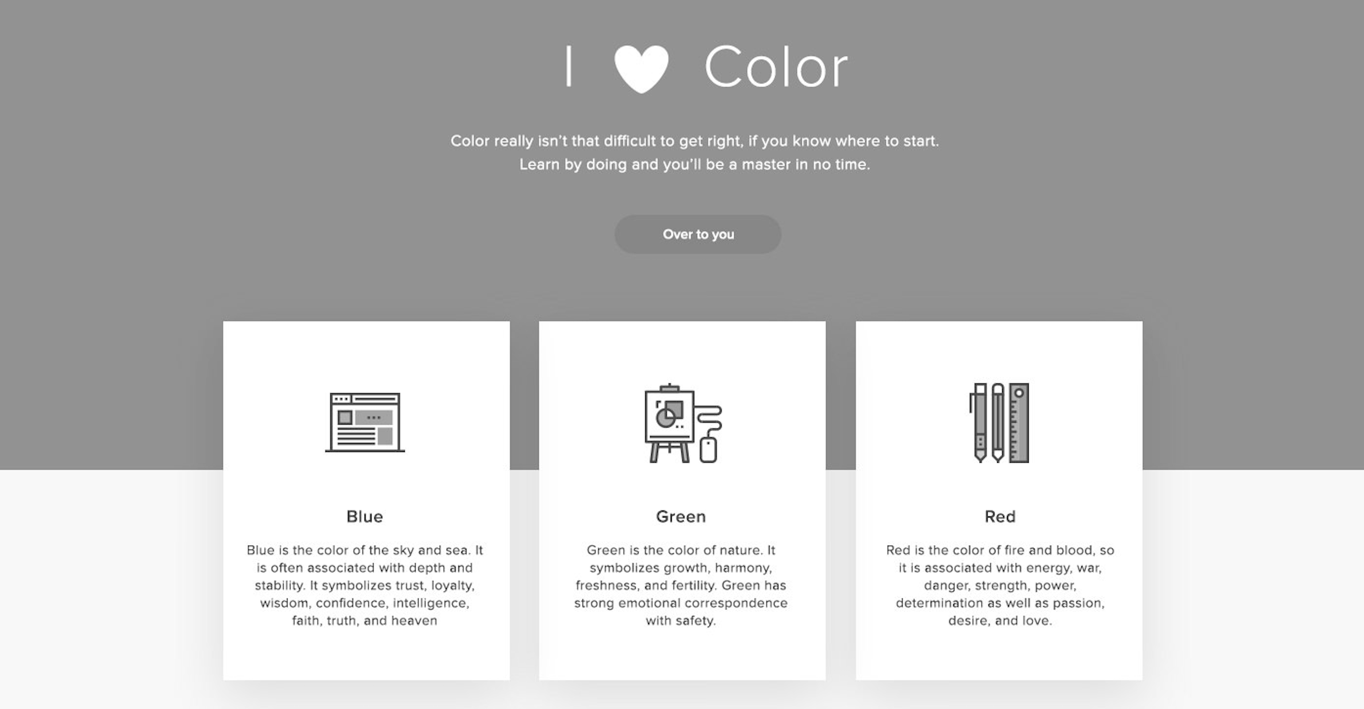
Blue
Because blue naturally reduces hunger, employing it on a food-related website may turn off visitors.
Many people believe this is because there aren’t many blue items in regular cuisine.
However, outside of the food industry, blue is one of the most preferred hues among both men and women.
Because so many individuals are instinctively drawn to it, companies often employ it to reassure or encourage trust.
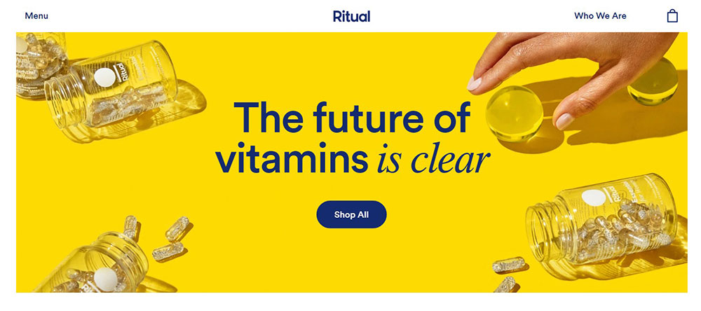
Yellow
Yellow is a happy and joyful colour, yet it is also used for warning signals.
It’s an intense hue that evokes emotion, which creates excitement for your website visitors when used sparingly but rapidly becomes harsh and overbearing when used in big quantities.
Yellow may be an excellent accent colour for drawing attention to a particular call to action.
Green
Green has such strong links with nature and being ecologically friendly that the hue alone may convey an ethical message.
Green is also becoming more popular since it combines the soothing benefits of blue with the invigorating impacts of yellow.
Money and growth are also prevalent links, making this an increasingly popular option across a wide range of sectors.
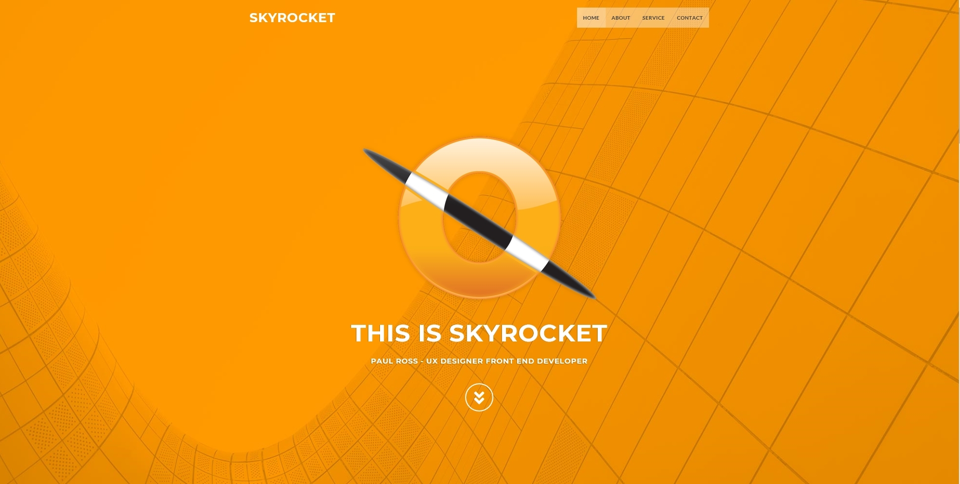
Orange
Orange is the new black, and red is the new black, but it’s a difficult hue to deal with.
Although it is popular with children, most adults either adore it or despise it.
As a result, implementing it into your adult-targeted website should be done with caution.
Because orange is strongly linked with energy, excitement, enthusiasm, and warmth, it may play an important part in developing your brand’s identity and motivating site visitors to take action.
White
If you’ve ever heard the phrase “white space,” you’re probably aware of how significant the colour white is in web design.
White offers a feeling of independence, giving your site visitors the visual breathing space they need to process the information you present.
But white has a significant disadvantage: it may be unpleasant on the eyes when genuine white (#ffffff) is combined with true black (#000000), and can be seen as cold, stark, or off-putting.
A sensible approach is to use an off-white, such as ivory, which has the same advantages as white but a little warmer, more welcoming tone.
Black
Although black is one of the most popular hues, it should be utilised with caution since it has many contradictory implications.
It’s edgy, but it’s also business; formal, but it’s also classic.
When used sparingly, black may provide a grounding effect, but when used freely, it can quickly overwhelm the whole design.
The good news is that both black and white have a wide range of tones, so employing deeper colours and lighter tints may provide the same benefits with less negatives.
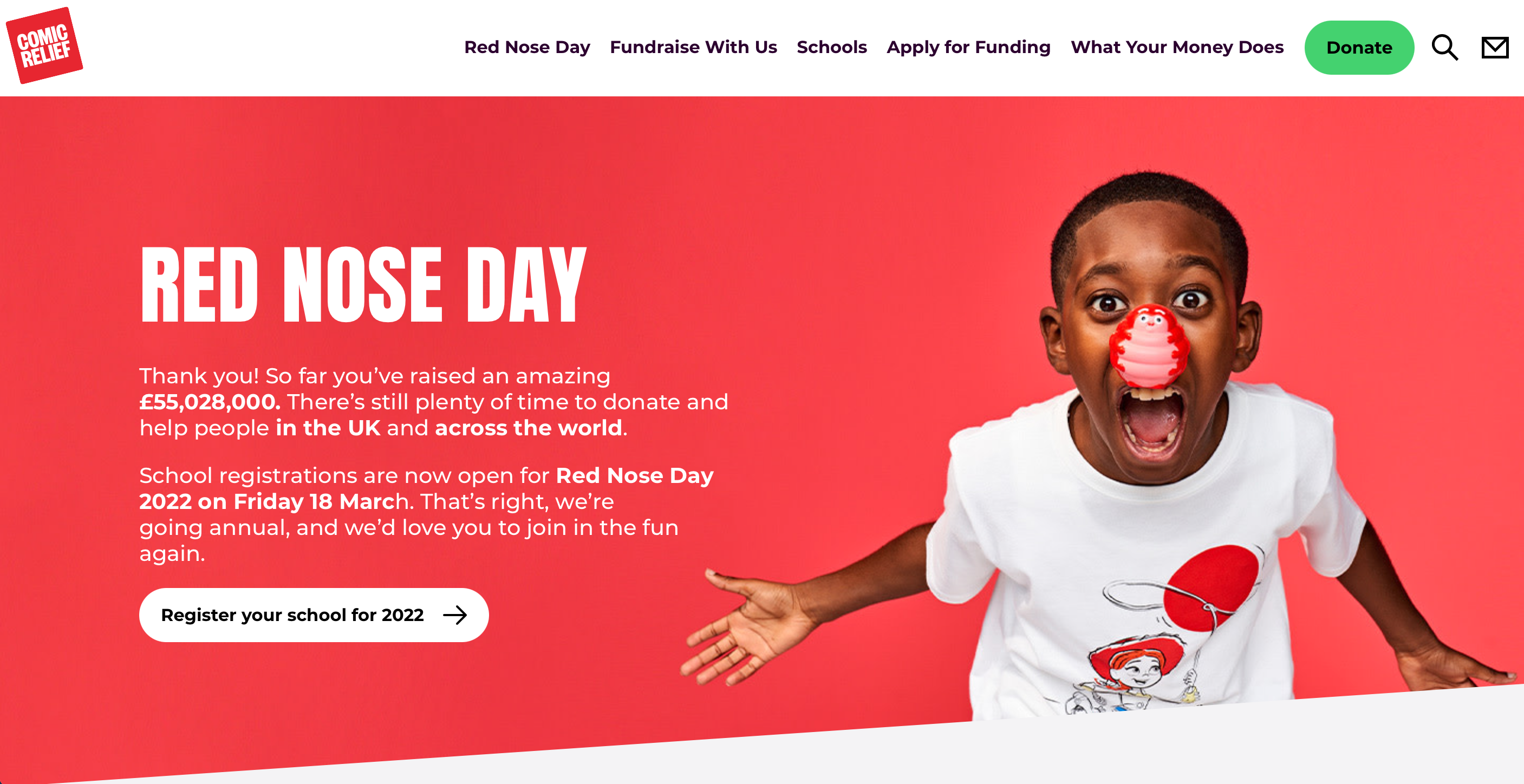
Red
Red elicits powerful emotions, maybe due to its prominence in the colour spectrum.
The colour red is often linked with love, passion, and drama, but it may also represent power, aggressiveness, or even wrath.
As a result, it is advised to take it in tiny dosages.
Because it aggressively encourages action, many web designers believe it is the greatest solution for buttons and other calls to action.
Research does not always back up this assertion, so don’t think it’s your only choice – we discussed our approach to compelling calls to action in full in a recent blog article.
Purple
Purple, like orange, may be controversial; it will likely attract female clients while repelling male ones.
Purple mixes the strength of red with the solidity of blue, contributing to its royal richness.
Purple may also represent mystery, creativity, and wisdom.
It is not suggested for all sectors, but for a few, it may be the best option.
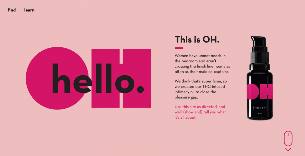
Pink
Pink has strong gender connections and is often used to represent femininity and gentleness.
In lighter tones, it might seem delicate and fragile, like a flower, yet in darker shades, it can appear ecstatic or raucous.
Pink, like red, represents love, but it’s a softer, more personal love than the fiery intensity associated with red.
This suppleness lends itself perfectly to infant and confectionary items.
Brown
Brown is the least popular web design colour.
It is disliked by both men and women, and it may be difficult to mix with other hues.
Its good implications include reliability and sturdiness, but keeping it from seeming drab and gloomy requires a great eye for design.
Blush, a very precise tone of nude pink that verges on beige, has been an increasingly attractive contemporary alternative to both pink and brown in recent years.
Businesses that cater to women, particularly women in their 20s and 30s, often utilise blush as a neutral with more feminine overtones instead of tan or beige.
Step 2: Think about which colours are appropriate for your sector.
While it is unlikely that your company’s purpose is to entirely blend in with the competition, there are certain colours that are only appropriate for specific sectors (and other colours that can send your users running away).
Colors that are often used throughout sectors include:
Blue

Medicine, science, utilities, government, healthcare, recruiting, legal, information technology, dentistry, corporate
Green
medicine, research, government, recruiting, environmental business, tourism, human resources, and finance.
Black
Construction, corporate, oil, finance, fashion, manufacturing, cosmetics, mining, marketing, and tradesmen are all black.
Grey
is used in automobile, journalism, clothing, and technology.
red
fashion, beauty, cuisine, dating, video games, retail, automotive, hardware, video streaming
Orange:
beverages, shopping, and fitness
Yellow
automotive, retail, food, technology, and construction.
Pink
medical (paediatrics, OB/GYN), cuisine, cosmetics, and retail.
While these trends should not limit your colour choices for your website, they are trends for a reason.
Chances are, your company’s overall message is comparable to that of your closest rivals, so selecting a hue that is completely out of character for your industry may harm (by conveying the incorrect message to buyers) rather than assist (by making your brand stand out from your competitors).
However, sometimes deviating from industry norms pays dividends.
Step 3: Think about your target market and their preferences.
Step one also includes some information regarding colour preferences between genders, but did you realise that there have been some very extensive research on this subject?
It’s more complicated than “women like purple and guys don’t.”
There is a wealth of information available on gender and colour preferences:
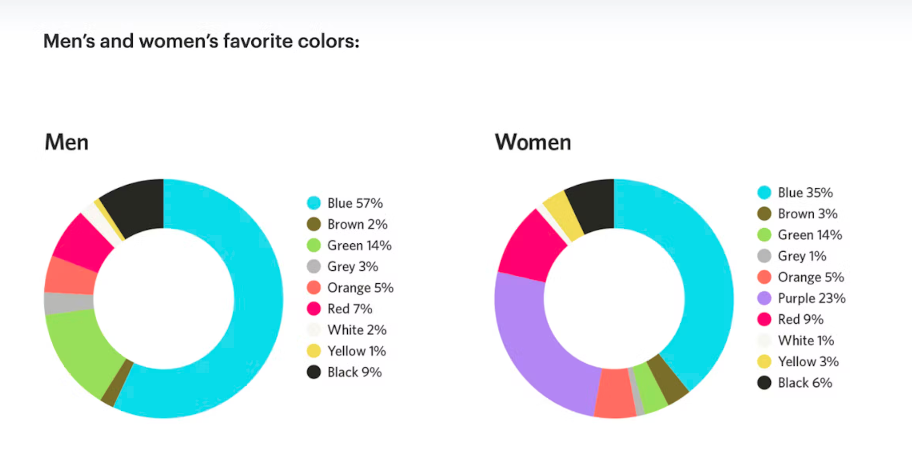
Blue is the most popular hue in the world (it is preferred by 57% of men and 35% of women).
Men choose blue (57%), green (14%), black (9%), and red (7%).
Fewer than 5% of males stated their favourite colour was orange, yellow, brown, grey, or white, while 0% said their favourite colour was purple.
Blue is the most popular colour for women (35%), followed by purple (23%), green (14%), red (9%), and black (6%).
Fewer than 5% of women stated their favourite colour was orange, yellow, brown, grey, or white.
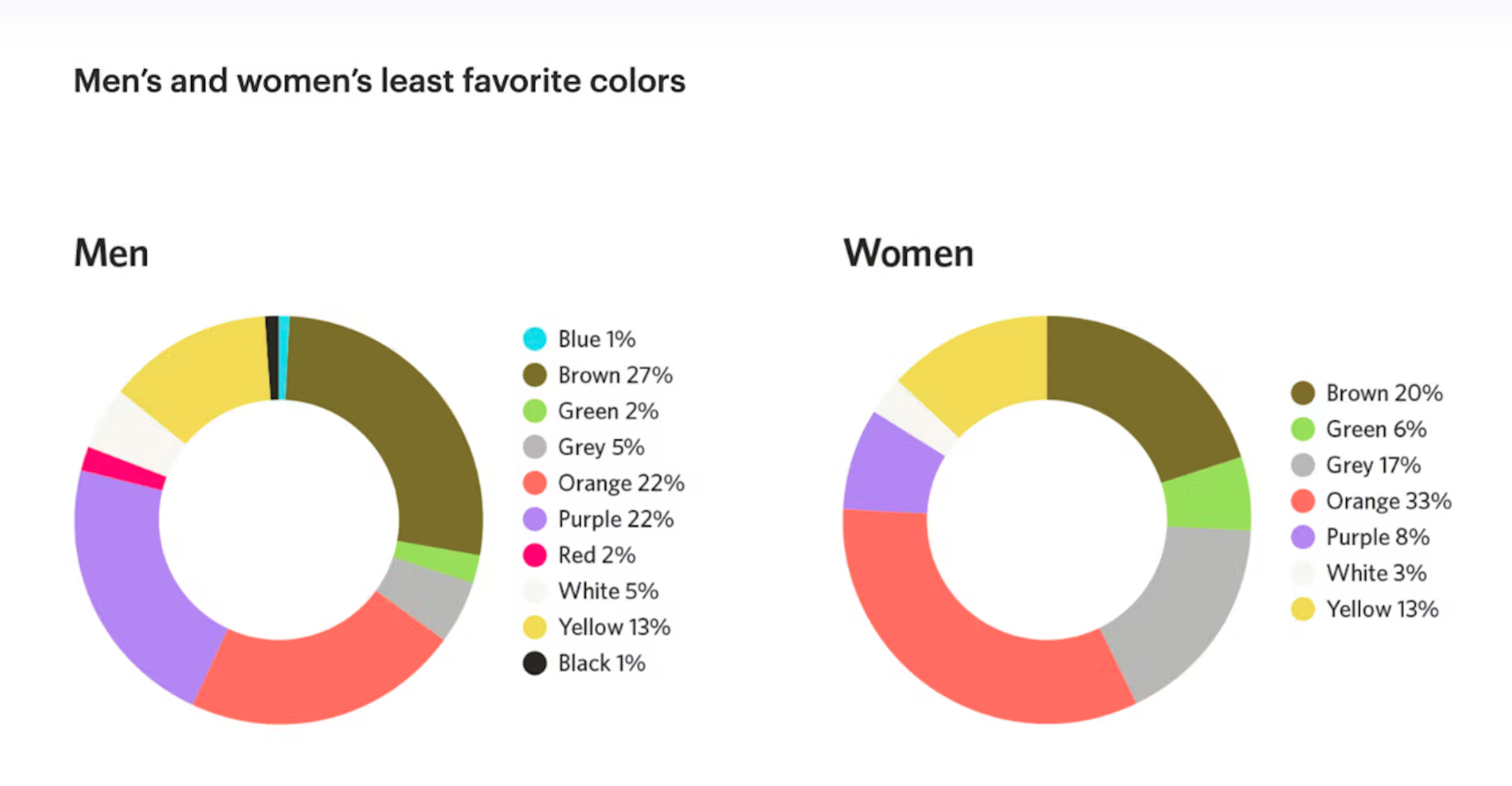
Orange and brown are the least favoured colours in both genders, with 22% of men and 33% of women hating orange and 27% of men and 20% of women disliking brown.
Men favour bright colours, whereas women prefer softer hues.
However, your target demographic might be characterised by factors other than gender.
Color psychology data are also available by age, class, education, and even climate.
Check out these fascinating facts:
- Colors that appeal to young children include red, yellow, blue, orange, green, and purple.
They also prefer solid colour blocks over patterns. - Teenagers, unlike their younger siblings, frequently favour black and are more receptive to more graphics and sophisticated hues.
- Most people, in general, prefer modest hues, and their colour choices are fixed in stone.
- Adults over the age of 65 prefer blue, pink, and green over yellow.
They favour calmer colours over bright, exciting ones, and purple grows increasingly popular among women as they become older. - Working-class people like vibrant versions of main and secondary colours.
Meanwhile, affluent individuals like more complex hues, frequently tertiary colours with a wide range of tones. - The more educated a person is, the more sophisticated their colour selections are.
People with a higher level of education prefer tertiary colours, whereas those with a lower level of education prefer primary and secondary colours. - People choose colours that are similar to the colours seen in their environment.
Others who live in tropical areas like bright, warm colours, while people who live in cooler climes prefer more muted hues. - White is widely used at weddings and hospitals in Western cultures to signify purity and cleanliness.
White, on the other hand, represents death and grief in Eastern cultures and is often utilised in funeral rites.
You may now create a very comprehensive profile by combining your own colour choices, the emotional meaning connected with colours, the prevalent colours used in your business, and the preferences of your target audience.
This is excellent news for those of you who have been hesitant to blend in with your competition – even though you’re in the same overall sector, the precise demographics of your target market may lead to some separation between your businesses.
Step 4:
Remember that how you blend colours is more important than the colours themselves.
At the end of the day, two websites with the primary colours blue and white might appear and operate very differently.
Hue psychology is more than simply selecting a single colour to represent your business; it entails aspects like as colour schemes, white space, and strategic positioning of certain colours, allowing a broad spectrum of variability even with the same main colour.
Many web designers propose that every website include at least three colours: a backdrop, a base colour, and an accent colour.
Many people also propose the 60-30-10 rule, which states that you should pick three colours and utilise one 60% of the time (as the dominant), another 30% of the time (as a secondary), and the third 10% of the time (the accent).
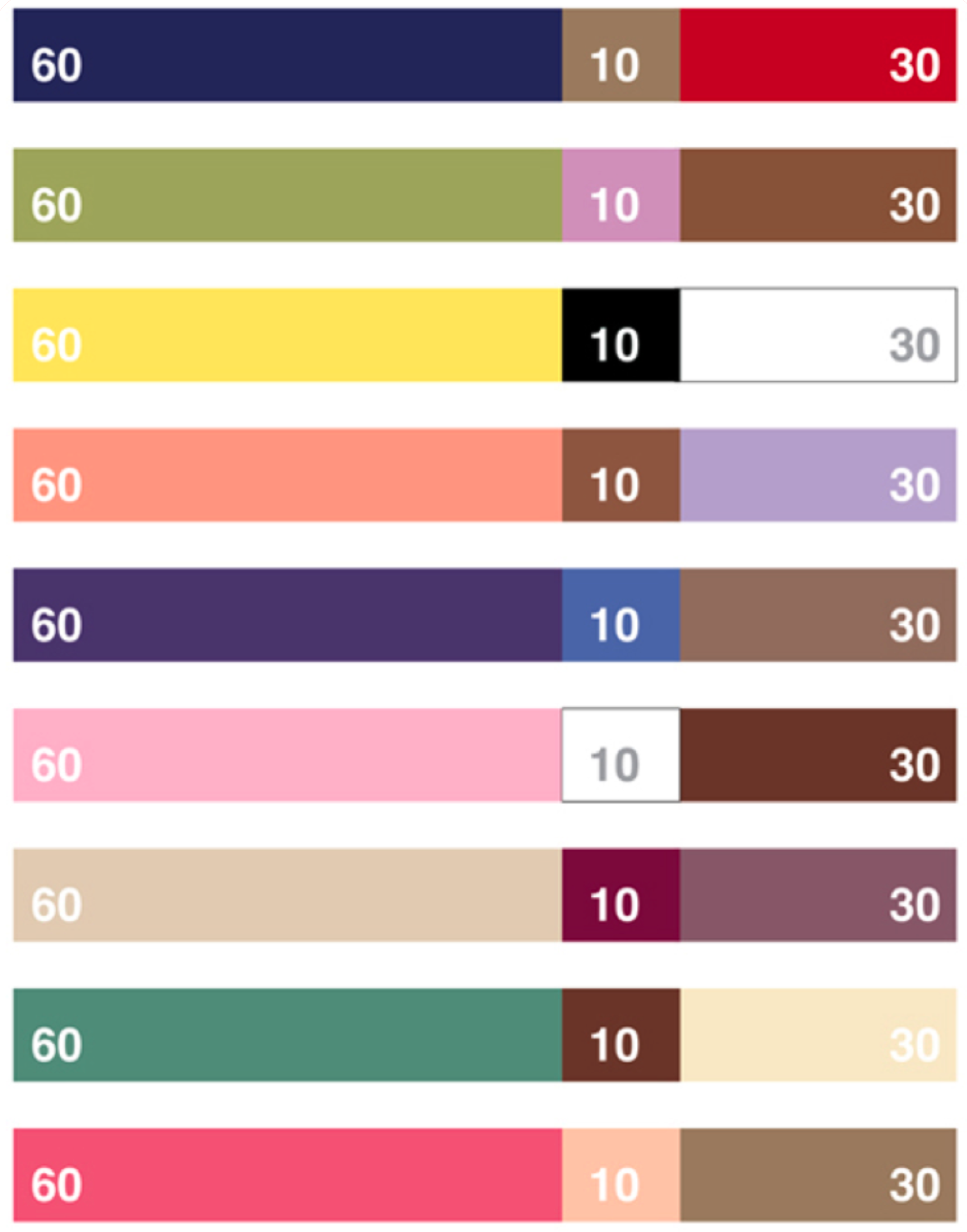
We usually just utilise one accent colour at Trajectory.
This makes our designs more aesthetically appealing, which keeps visitors’ attention where it belongs: on your carefully placed calls to action.
In terms of calls to action, the way you blend colours may influence how users interact with your site.
Bright colours like orange, green, and red often garner the most clicks, but depending on the colour scheme of your website, a different hue may give greater contrast – an important factor in capturing consumers’ attention.
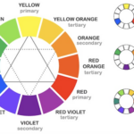
If you remember back to elementary school and the colour wheel, you may recall that you can create a wide range of emotions by combining various hues (if you don’t, check out Adobe’s free colour wheel palette generator for a fast reminder).
Even once you’ve chosen your foundation, you’ll have practically limitless colour scheme options.
When we add in elements like the quantity of white space and the tints, hues, tones, and shadows, one website utilising red, white, and black suddenly appears radically different from another using the same colour scheme.And that’s before we even get into the design of the site!
Several last thoughts
It’s evident that colour psychology is more than just leaning toward hues you enjoy.
Even utilising colour psychology to better understand your target clients might help you sell to them in the future.
If you’re feeling overwhelmed by all of your choices, keep the following ideas in mind:
To begin, keep in mind that colour perception is subjective.
While there are some greater message patterns in how individuals see colour, so much of it is influenced by personal experiences.
Just because statistics suggest to one set of colours for your target market does not imply it is the best option.
And even if you already have a logo with a set of colours that you want to remain with, there are measures you can do to leverage colour psychology to your benefit without completely rewriting your brand.
Simply changing the call to action and the amount of white space on your website may make a significant effect.
Finally, it is not only determined by the colours you choose.
While various colours have distinct connotations and different demographics have varied preferences, the most crucial issue is how a user sees the colour in relation to your brand.
Your colour choice may elicit feelings unrelated to your brand, which may be just as off-putting to clients as their least liked hues.
Of all, there is always place for intuition – even in business.
Listen to your instincts if all of your research leads you to select a colour that seems completely inappropriate for your business.
You may be shocked at how observant your consumers are, and when you pick colours, branding, and methods that you can stand behind, your customers will notice.
Do you still have doubts concerning the colour scheme of your website?
Please contact us and tell us about your difficulties.