How to choose the right type of images for your website
Here Are Some Guidelines to Help You Pick the Perfect Website Image

Never underestimate the power of images for your website!
Although this statement is not strictly true, it does highlight the importance of having high-quality images on your website.
How do you know you’re taking your website’s visuals in the appropriate path for your business when there are so many options?
Guidelines for picking the perfect website image
Since pictures and photos have long played an important role in conveying ideas visually, it’s crucial that the ones you use on your website are optimised for viewing on a wide range of devices.
Indeed, 51% of B2B (Business to business) marketers say that making visual assets is a top priority for their content strategy.
You should not underestimate your listeners’ intelligence.
They are able to tell when you are making use of a generic stock photo, especially if it is unrelated and of poor quality.
Selecting an inappropriate image might have far-reaching consequences for your website.
It can have an effect on both the user interface and user experience, so be careful.
Not sure which images to use, how to optimise them for search engines, or what format to save them in?
Don’t stop reading now.
1 always use high-quality images

You should only use high-quality photos.
Best results are achieved with high-resolution, large-pixel images.
Consider the display sizes of various devices that visitors might use to access your website.
2. Make the images are appropriate for your brand
Whatever you’re offering or hoping to accomplish with your website, the photos you use should reflect both your brand and your intentions.
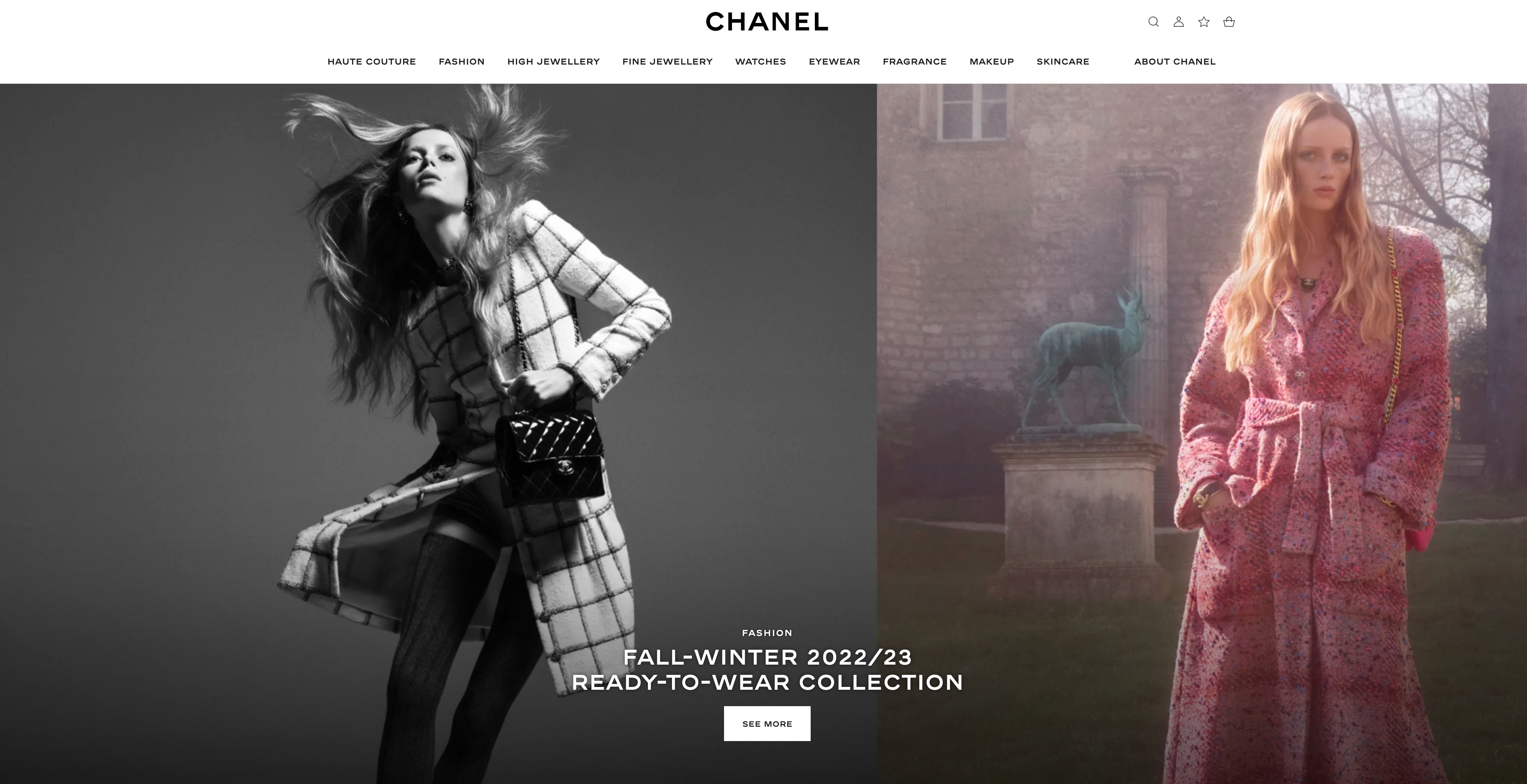
If your company is, say, Chanel and you sell nothing on your website, the pictures of your wares ought to be both eye-catching and attractive.
3. Influence uses to click on the image. (Call to action)
Need a customer to take a certain action?
Use a picture as both a call to action and a visual aid.
Many popular food brands have achieved this level of success.
For instance, the ever-evolving menu at Starbucks makes it simple to choose the right espresso beverage the next time you need a pick-me-up.
Simply perusing these alternatives has my mouth watering.
I’d like to order both, if possible.
4. Let the picture speak for itself
Get the attention of your website visitors by using an eye-catching image.
Use an appropriate image to convey your message instead of cramming your page with text.
Not all of your consumers will take the time to read the text, even if it is interesting.
Without immediately delving into detail about the ingredients and the brand story, allbirds’ webpage conveys the notion that their products are natural.
5. Feature actual individuals
If you want to increase your website’s conversion rate, an excellent strategy is to use an image with people in it.
In this case, it’s best to use actual people rather than stock photographs.
If you use a stock photo, the image you chose may already be featured on hundreds of other websites.

6. Search Engine Optimization
It’s important to spend the time optimising every image you post to your website, whether it’s a blog, an online store, or a simple informational page.
In the first place, as we’ve already covered, the pictures should appear decent.
The next step is to give the image file a name that will help search engines locate and index it.
You should not do this with any of the photographs on your website.
Be consistent, and don’t use spaces or punctuation in names.
Similarly, hyphens should be used in the name rather than an underscore.
The alt text should be included after the image file name has been properly structured for SEO purposes.
The alt text of an image is a brief explanation of what the picture is of, usually no more than 100 characters long.
Although site visitors won’t be able to see this text, it does help search engines understand what the image is about.
Users of speech-enabled browsers will also benefit from this text’s inclusion on your site.
Alternate text could read: Nighttime view of the Statue of Liberty if you used the image above as an example.
7. Select the appropriate image format

Need help deciding which image format to use?
Let’s dissect them and see what we find.
Photographs are best saved as JPGs because of the file format’s ability to store a lot of colour information with a minimal amount of data.
Because of this, you can utilise this image without worrying about the file size, which will speed up the loading process.
Images with big or flat regions of colour work best in PNG format, which is why you should use it for graphics.
Most logos, infographics, and visuals with plenty of text fall into this category.
A logo should ideally have a translucent backdrop, which is why PNGs are a great choice.
If you want more accurate colours and higher image quality, save your PNG in the “24-bit” format.
Get your website looking like a million bucks.
Including an appropriate image on your website is the final, delicious touch.
It’s the finishing touch that unifies the design and, with any luck, attracts repeat visitors by making the site more pleasant to look at.
Want to add more character to your digital presence?
Read on for advice on incorporating video into your website and selecting the right typeface.


